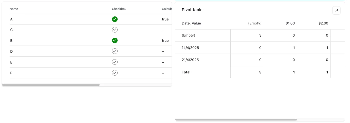
Hello - I’d be grateful if someone can help.
I’ve started using Pivot tables in Dashboard Interfaces. One problem I have is that the table seems to occupy a default size and this results in the columns being too wide. I’ve put an example of a simple frequency table of fruits below.
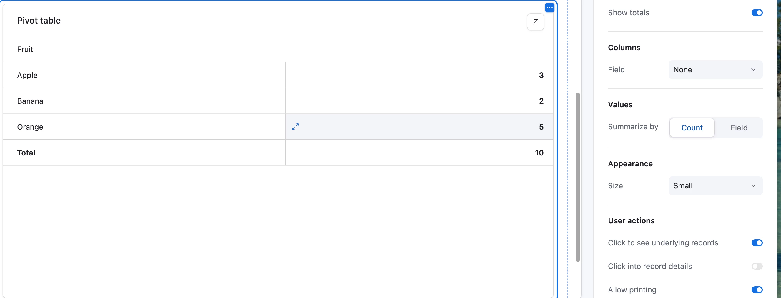
You’ll see the name of the fruit in each row is a long way from the corresponding count number. Is there a way to reduce the column width (or otherwise reformat) so that the label and number can be right next to each other (as in standard pivot tables in Excel/Sheets)?
Thanks for any tips you can share!