Showing ideas with label Interface Designer.
Show all ideas
Status:
New Ideas
Submitted on
Mar 28, 2023
09:44 AM
Submitted by
Matthew_Carrano
 on
Mar 28, 2023
09:44 AM
on
Mar 28, 2023
09:44 AM
What is the proposed idea/solution? We need the ability to make more robust charts in interfaces. How about bringing something like the vegalite extension to interfaces? PLEASE How does it solve the user problems? Basic visualizations like overlaying a line and bar chart can't be done, but vegalite can do things like that and much more. Who is the target audience? Anyone who wants to have robust data visualization in their interface
... View more
Status:
New Ideas
Submitted on
Jul 16, 2023
09:31 PM
Submitted by
Tobias_LGKR
 on
Jul 16, 2023
09:31 PM
on
Jul 16, 2023
09:31 PM
I would love to see a detailed change log by Airtable where everything that is added or changed gets documented. Everything. Things get changed, added and improved constantly. Often small and helpful things (that I need) which go unnoticed for quite some time because they are not communicated. I would consult such a change log page every morning before I start my work to see what exactly is new. It could be an improved version of the existing "What's new" page but with every detail, not only three changes per month often published way after the fact. That page is already fed by an Airtable app. So it would be extremely low effort to plug every development team into that tool to communicate changes as soon as they are rolled out.
... View more
Status:
New Ideas
Submitted on
Jan 04, 2024
08:29 AM
Submitted by
Dgoldstone8
 on
Jan 04, 2024
08:29 AM
on
Jan 04, 2024
08:29 AM
We use Confluence regularly and can embed AT views into our pages. However, we would like to do the same with our interfaces as it makes digesting content easier. Do you think this can be a feature in 2024?
... View more
Status:
New Ideas
Submitted on
Dec 10, 2024
08:44 AM
Submitted by
jamesnevada
on
Dec 10, 2024
08:44 AM
I've had a few cases where I was using views in the style of a "help desk" and really wanted to see the number of records that needed to be actioned on. It would be nice to have an optional badge count shown for records in a view or in the interface pages, especially for help desk and similar apps where the views and pages are filtered based on the actions needed to be taken.
... View more
Status:
New Ideas
Submitted on
Jan 02, 2024
08:21 AM
Submitted by
Tim_Berezny
on
Jan 02, 2024
08:21 AM
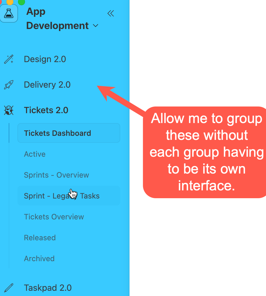
What is the proposed idea/solution? The add the ability to group pages on the left nav panel without needing to stick them into different interfaces. How does is solve the user problems? Once an interface has beyond 8 pages, it is too large on the left nav bar and pages need to be grouped. Grouping pages allows users to create a much better an organized user experience. Note that this grouping is currently possible by putting pages into separate interfaces, however this causes other problems since record details pages cannot be shared between interfaces (and cannot be deleted), making it extremely difficult to manage syncing record details pages between interfaces. Who is the target audience? Interface users.
... View more
Status:
New Ideas
Submitted on
Feb 22, 2024
06:25 PM
Submitted by
benburne
on
Feb 22, 2024
06:25 PM
For displaying trended data side-by-side, it would be great to have support for side-by-side bar charts!
... View more
Status:
New Ideas
Submitted on
Jul 27, 2023
03:04 PM
Submitted by
AaronBranch
on
Jul 27, 2023
03:04 PM
Seems like a no-brainer to me: It would be incredibly helpful to have an auto-generated legend for interfaces that shows users what the colors represent in the view. As it is now, the coloring helps to visually provide some differences but doesn't contain any usable information unless you can easily recall what 6 or 7 different colors mean. I think this would benefit most users! Bonus points for adding a color palette that is friendly for users with color vision issues.
... View more
Submitted on
Aug 05, 2022
11:46 AM
Submitted by
Annette_Langan
on
Aug 05, 2022
11:46 AM
I would love to see the ability to put Org Charts on an Interface. Our base is quite big, so Extensions load slowly and the dashboards take a while to navigate through, and it’s a pain to have to make a new views for each different org chart block. If we could take that feature and insert it on an Interface, our project leads would be able to see task relationships so much faster, all in one place (with the right configurations), and without the clutter of the rest of the base’s inner workings!
... View more
Status:
New Ideas
Submitted on
Dec 14, 2022
02:23 PM
Submitted by
Drew_Nemer1
on
Dec 14, 2022
02:23 PM
What is the proposed idea/solution? The current Interface Designer is great, but it can be a bit difficult to make every field we need visible organize on a blank page that fits our needs. It would be great if there were widgets that allow for the collapsing of a group of fields or organizing them into clickable pages. How does is solve the user problems? Make it easier to demonstrate steps and phases to projects. Instead of having every stage laid out on one part. Clicking right or left or collapsing and uncollapsing parts of the record can show different applicable fields. How was this validated? Simply that if one "page" is not completed per guidance set by the creator, one cannot move on to the next phase. or just organizing field attributes in a box that will allow for page creation. Who is the target audience? Companies that use AirTable to create work flows for employees
... View more
Status:
New Ideas
Submitted on
Apr 30, 2024
09:05 AM
Submitted by
Michael_Andrew
 on
Apr 30, 2024
09:05 AM
on
Apr 30, 2024
09:05 AM
What is the proposed idea/solution? Currently, there is significant differences in features across the different interface 'types'. Even among the 'elements' there are differences. For example, you can have a 'list' type (which has 'sort'), but if you add a 'list' element to another type (e.g. Dashboard), you don't get same capabilities (e.g. 'sorting', 'hierarchy'). It's as if all the 'types' are developed separately, and new features are not retroactively added to 'old' types. How does is solve the user problems? These inconsistencies in look and features are frustrating to builders who would expect that features are similar across elements.
... View more
