Showing ideas with label accessibility.
Show all ideas
Status:
New Ideas
Submitted on
Nov 06, 2023
01:21 PM
Submitted by
oreocereus
 on
Nov 06, 2023
01:21 PM
on
Nov 06, 2023
01:21 PM
Views are useful, but sometimes a view needs to have lots of information in it regardless to be useful. Side scrollling with dozens of columns can be unwieldy and difficult to navigate (especially as the user adds new columns in different views, and they automatically place them at the end of other views). Colour coding and/or being able to group columns would seemingly be a simple to implement and very useful functionality. Grouping columns would be nice for tabbing between views and being able to move a bunch of columns at once (or unhide a column and have it snap to it's "group").
... View more
Status:
New Ideas
Submitted on
Mar 13, 2023
03:32 PM
Submitted by
Karlstens
 on
Mar 13, 2023
03:32 PM
on
Mar 13, 2023
03:32 PM
Button Fields could really use an update to allow for dynamic button labeling. A label could be set to not only Single Line Text, but also support other field types such as Single Select, Link Fields, but also Attachments where an Image could be displayed as a clickable button. Here, we see each button opening a unique URL, however the label is static - locked as the text "Open URL" which is an awful user experience. Why not allow for other fields to be referenced within the Label, exactly how the URL formula works? Part of this issue stems from the URL field itself also being too simplistic, and not supporting text for the referenced URL itself (which then itself could be used by a button field, without the need for an independent Label field).
... View more
Submitted on
Mar 01, 2019
08:10 AM
Submitted by
Michelle_Tuten
 on
Mar 01, 2019
08:10 AM
on
Mar 01, 2019
08:10 AM
Good morning, I did an accessibility test of a form that I built through AirTable and found the following issues that I would like to suggest that you repair. I would like to create a similar form that will be available to the public through our website, but until the accessibility improves, I will not be able to do so. Checkbox box and other input field borders need stronger color contrast. Linked text need stronger color contrast. Markers indicating the Required status of questions do not have strong enough color contrast. Checkbox field needs a label in order for screen reader users to know what “clickable” means. Single Line Text fields should really have programmatically identified labels for screen reader users. Perhaps the title/question as worded in the form could be used as the label. For mulit-select option with the list format, it would be nice if the checkboxes were programmed to be announced as checkboxes to screen reader users. Also, if these options were truly in a list format, a screen reader user should be able to hear “List with [ # ] list items,” before entering the list. For the single-select option with the list format, it would be nice if the radio buttons were programmed to be announced as radio buttons to screen reader users. Also, if these options were truly in a list format, a screen reader user should be able to hear “List with [ # ] list items,” before entering the list. I would like to request that the form design be double checked to make sure it does not cause a keyboard trap when a screenreader/keyboard users tabs through a page in which the form is embedded. In my quick test, it appeared to me that it does cause a keyboard trap prior to submitting a response. Once a response is submitted, the Add another response button is not accessible to the screenreader/keyboard user, but the user is no longer trapped in the iFrame. When required fields are not filled out, the error message does not have strong enough color contrast. Fields that require a URL allow submissions of non-URL content. I think that adding an error message that appears when the submission does not include http:// is good usability, if not accessibility. The Submit button and " Never submit passwords through Airtable forms. Report abuse." message at the bottom of the form, does not have strong enough color contrast. I did not see where the Report Abuse link was included in the Tab order.
... View more
Status:
New Ideas
Submitted on
Dec 06, 2022
12:28 PM
Submitted by
Drew_Nemer1
 on
Dec 06, 2022
12:28 PM
on
Dec 06, 2022
12:28 PM
What is the proposed idea/solution? At the moment, you cannot readily access the Page Designer through Interface when trying to implement a button. How does is solve the user problems? I would like staff to be able to generate letters in AirTable, but they work out of the Interface, exclusively. How was this validated? ... Who is the target audience? ...
... View more
Status:
New Ideas
Submitted on
Mar 07, 2023
07:32 AM
Submitted by
estevamfurtado
on
Mar 07, 2023
07:32 AM
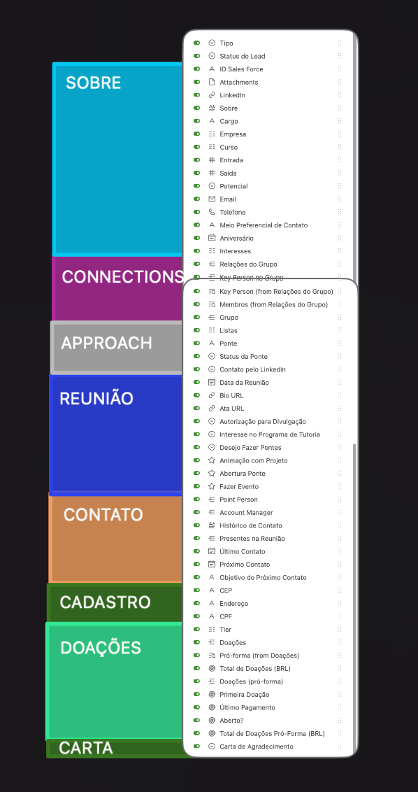
What is the proposed idea/solution? A feature that lets you group fields by context. As simple as that. Above is an extreme mvp, but i guess it should be something in that path. How does is solve the user problems? It would help creators manage fields when a table gets huge (in columns). It would be easier for anyone to better understand the table schema. How was this validated? I am using Airtable in my team with a lot of people getting to know the base and sometimes it is overwhelming for them to process every column in their minds. It is not visual and I had to do it outside to show them. I know it could be viewed as many 1:1 relations, so one could say "the user should create new tables". OK, but then there are some problems If the user needs to access those info in the table (for filters, calculations or interface designing, lets say) it would have to lookup these fields - the problem would still exist. Who is the target audience? I think every member on a team with creators that are heavy users.
... View more
Status:
New Ideas
Submitted on
Jun 06, 2024
11:53 AM
Submitted by
rsmith-pivotbio
on
Jun 06, 2024
11:53 AM
It would be nice to optionally enable Clean URLs for Airtable pages. Currently, Airtable urls are basically a random string of characters that give no information on what is at the url. So if I shared an Airtable link with someone, instead of seeing something like https://airtable.com/appdfvokijweroiwdroikj/tbldfvolkfgvlmkvblk/viweiociokjwefn and have no information on what they are about to click on, it would be something like https://mycompany.airtable.com/my-awesome-base/my-great-table/grid-view
... View more
Status:
New Ideas
Submitted on
Feb 23, 2024
04:11 AM
Submitted by
Jordanwoods
on
Feb 23, 2024
04:11 AM
Imagine a panel above the tables that toggled a group of tables! This way, you could have big bases organized a lot better. I have some bases which have a different sections that are co-related.. it'd be nice to organize the "Enrollment" section as separate from the "Registration" section and as separate from the "Billing" Section without having to do complex base syncing. I like having everything from one business in one base but the table tabs fill up quick!
... View more
Status:
New Ideas
Submitted on
Feb 14, 2023
11:52 PM
Submitted by
Marks_GmbH_Nord
on
Feb 14, 2023
11:52 PM
What is the proposed idea/solution? It would be very helpful if you could temporarily turn on and off the conditions/settings in the filters, groupe settings and sorts. How does is solve the user problems? If you want to deactivate the conditions for a short time, you always have to delete them and create them again. This is very tedious. Who is the target audience? all user
... View more
Submitted on
May 22, 2019
02:30 PM
Submitted by
Aaron_Alberto_G
on
May 22, 2019
02:30 PM
Activate an option to scroll horizontally with the mouse wheel. Useful on table view when having lots of fields.
... View more
Submitted on
Feb 28, 2022
02:09 AM
Submitted by
Augustin_Clouti
on
Feb 28, 2022
02:09 AM
in the ‘button’ field type, I’d love to see an option to include a secondary confirmation button on click of the main button. This would prevent bad consequences related to accidental clicks on buttons. Most of the time, the buttons I include in my tables trigger quite elaborate automations and I’d like a simple way to make sure that my users don’t accidently press the button and trigger a cascade of unwanted changes. The confirmation window could even include a customizable message for the user.
... View more
