Showing ideas with label Base design.
Show all ideas
Submitted on
Jun 29, 2020
09:52 PM
Submitted by
Alexander-Jerry
 on
Jun 29, 2020
09:52 PM
on
Jun 29, 2020
09:52 PM
Just a quick suggestion: I use webhooks in my buttons to start and top timers in my timesheet tracking service: however, I would really like to be able to click on a webhook without having to immediately close the tab.
I could set-up a macro to close a tab automatically after a time interval, but I thought I would pop in here and suggest that we have that added layer of control in terms of what pops up as we click a button.
In another use case, sometimes I want to run a script to perform background tasks, and I don’t need to see the console. I would love the script to be able to run in the background without necessarily loading the dashboard - and I realize there is probably a limitation here, regarding only being able to use a block if it’s fully loaded on the screen.
In any event, these are my two cents! I am really enjoying the Button field, it really helps Airtable perform more like an application than a spreadsheet - there have been so many great updates recently, I’m excited to see how Airtable will evolve over the years.
... View more
Status:
New Ideas
Submitted on
Aug 01, 2024
07:08 AM
Submitted by
chris-bern
 on
Aug 01, 2024
07:08 AM
on
Aug 01, 2024
07:08 AM
What is the proposed idea/solution? Option to colour table tabs in classic grid view. How does is solve the user problems? As a database grows, there can be quite a lot of tables in a base. Mine has 25 tables that I use. It gets tedious looking for the right table. If there was an option to colour table tabs by topic, it would be much more intuitive to find the right table quickly. How was this validated? From experience - I often find myself searching for a table, especially when I'm working on a laptop screen (13-15'') and not all the tables are displayed at once. Who is the target audience? Anyone with more than 10 tables in a base.
... View more
Status:
New Ideas
Submitted on
Jan 07, 2023
05:40 AM
Submitted by
matt_stewart1
 on
Jan 07, 2023
05:40 AM
on
Jan 07, 2023
05:40 AM
User/collaborator fields are kind of a hot mess. It shows 100% of all users, including deactivated users, as options to select. What is the point of user groups if we can't make this a feature to limit options based on a user group? This would allow us to setup multiple user fields for a project and allow each team to manage their team assignments, with only a list of those options on their teams. Then using kanban or timeline view, you would be able to see only the lanes/groups of those in your team for workload balance, etc. Currently when a user selects a user field, they see 100's of users to choose from. And even worse, in a kanban view they see lanes for all 100's of users. Not even an option to limit by only users with projects assigned. So unless you have an extremely small number of collaborators the kanban view is useless for using collaborator field.
... View more
Submitted on
Jun 18, 2020
11:15 AM
Submitted by
Sal_Ohcin
on
Jun 18, 2020
11:15 AM
For those with LONG records (such as >30 fields)…
Wouldn’t it be nice to VISUALLY break up the record in a way such that you know where you are in the record?
I routinely work on a database that has approx 60 fields per record. The new Conditional Forms field on Airtable has been a lifesaver and is a GREAT upgrade.
However, when you are NOT entering the data in the “Form”, but rather looking at the record in the Grid view, you still see all the fields and it can be overwhelming to scroll through them all. (And in my case, creating a different view with some fields turned OFF is not a good solution)
My idea would be to add horizontal divider lines and/or spacers to visually break up the record to allow you to see where you are within the record.
Alternative #2, have vertical colored lines that run along the side of the opened record which signal where you are in the record. (You could choose the color label when you create the field).
See example below:
... View more
Submitted on
Feb 24, 2020
11:44 AM
Submitted by
Kevin_Li
on
Feb 24, 2020
11:44 AM
Grouped records and the summary bar - functionality here is great, but the only way to sort the grouped records is by the order of the grouped by field options. I’d like to be able to sort by the numerica values in the summary bar (e.g. revenue or # of records)
... View more
Status:
New Ideas
Submitted on
Feb 23, 2024
01:12 PM
Submitted by
Adn1001
on
Feb 23, 2024
01:12 PM
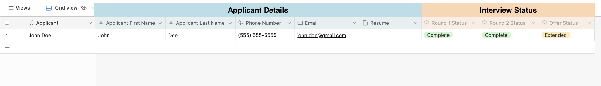
Our team really needs the ability to group fields together and visually display those groups, similar to adding an extra header row in Excel (example below). Benefits: Enhanced Visual Clarity: This feature will provide an improved visual understanding of the relationship between different fields, eliminating the need for users to check each field's description separately. Improved Organization: This feature will allow users to categorize and group related fields together, enhancing the data's structure and making it easier to navigate and understand. Personalization: By allowing users to change the color and title of the group, the feature adds a layer of personalization, making the data representation more intuitive and user-specific. Use Case Examples: Project Management: In a project management base, fields can be grouped together based on different project stages, team responsibilities, etc., enhancing the understanding of project flow and status. CRM: In a CRM base, fields can be grouped by customer details, interaction history, deal status, etc., providing a better overview of customer relationships. HR Management: In an HR base, fields can be grouped into "Applicant Details" and "Interview Status", making it easier to track the recruitment process. Event Planning: In an event planning base, fields can be grouped by event details, participant information, logistics, etc., enhancing the event management process. This feature, with its focus on improving visual understanding and data organization, aligns with Airtable's commitment to making data management more intuitive and user-friendly. Requirements Ability to create groups of related fields. Ability to assign individual fields to these groups. Ability to distinguish each group visually in both List and Grid views. Ability to display the name of the group in a master header above the respective grouped fields. Ability to personalize the appearance of these groups. Ability to change the color of a group. Ability to change the title of a group.
... View more
Status:
New Ideas
Submitted on
Feb 01, 2024
11:48 AM
Submitted by
Russell_Findlay
 on
Feb 01, 2024
11:48 AM
on
Feb 01, 2024
11:48 AM
What is the proposed idea/solution? for better accessibility - please label the colours with text - when hovering over in the base design How does is solve the user problems? 1 in 12 men and 1 in 200 women have some form of colour blindness - or colour visual deficiency. This means that distinguishing many of the colours in airtable is difficult. Giving bases different colours is great as this is both a visual cue when you use multiple bases and interfaces - and in communicating with the teams that use them - however when some users aren't clear which colour is which (I am one and i develop tools heavily in the platform) it causes needless friction - for what should be a quick fix How was this validated? please see standard accessibility guidelines for using colours and ensuring those with sight problems can see the tools effectively. Who is the target audience? all users and all users with colour blindness - e.g. disabled providing greater accessibility.
... View more
Status:
New Ideas
Submitted on
Jun 14, 2023
12:38 AM
Submitted by
Tobias_LGKR
on
Jun 14, 2023
12:38 AM
We are currently consolidating our style guide in Airtable. It would be of great help if a new HEX field and a new COLOR field were introduced to use as a design color for fields, text, shapes or backgrounds in interfaces. The new COLOR field would then display the color of a selected HEX field, both in tables as in interfaces. Along that same line it would be great if Admins could define global HEX colors for the entire workspace, so these colors can be used to brand the user experience for everyone. These custom colors would then show up as a custom color list everywhere in Airtable, where colors can be used/selected.
... View more
Status:
New Ideas
Submitted on
Mar 25, 2023
11:06 AM
Submitted by
Alex_Gribov
on
Mar 25, 2023
11:06 AM
Would be nice if we could have a way to manually sync a synced base from within an interface - I've designed interfaces for all our team's workflow's, but if you edit data in another base you still need to manually go to the table right click on the name, and click sync, then go back and wait. This is a pretty cluttered workflow to just get updates. Would be even better if there was two-way sync (edit on either side of the sync) and/or constant automatic syncing, but in lieu of those features this would be nice.
... View more
Status:
New Ideas
Submitted on
Aug 03, 2023
01:01 AM
Submitted by
Ilias_T
on
Aug 03, 2023
01:01 AM
Our beloved platform seems to ignore thousand of users and so we are still struggling with numbers and the use of comma instead of dot for decimals. To do that, we have to literally TRIPLE the number fields. Even though many have asked for it, we still miss printing an interface. Of course they also ignore many users that need a multi page designer !!! These 3 requests are not new! The first one dates back the first years of this platform. They don't even have an answer for that ! They just ignore us I'd appreciate if I could: Have a Global Field for each table Had more possibilities to edit the text in an Interface (for example: align text) Guys if none of these are scheduled to be fixed then I kindly ask the co-users suggestions for other platforms - data bases.
... View more
